


Last time I briefly went over some of the obvious difference between OBIEE 1OG and 11G in terms of working with the rpd using Admin Tool. This time let's take a general overview on what the front end presentation service looks like in 11G compare to what it used to be like in 10G.
For those who have quite a lot of experience with 10G but haven't had hands-on experience working with 11G, I hope this article will help you better relate the things you are already familiar in 10G to how it is now in 11G.
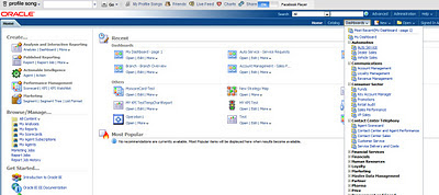
For the most parts, things aren't that different in 11G despite what it seems. However, there are many new features added in 11G and also there are changes being done. Whether we like it or not, it will take some getting used to. There are some changes in 11G that I don't quite like, but again, there is nothing we can do about but to get used to it. So let's start by taking a look at the initial UI upon logging in:

You see, I have divided the UI into 5 sections, each one is labelled with a letter. We will go over what each section does.
Section A: This section is named 'Create'. If you look closely, you will see a list of things underneath such as Analysis and Dashboard, Published Reporting, Actionable Intelligence, Performance Management and Marketing.
If you are familiar with 10G, you will know that in 11G they are calling 10G reports as 'Analysis' meanwhile BI Publisher Reports are called 'reports', Ibots are now 'Agents'. So this section is nothing but the place where you would start creating new objects. 11G allows us to create scorecards as a performance management measure, if you want to know how to do so, there is a good article out there that gives excellent details, you can find it here.
Section B: Although visually this section is the largest, it is nothing more than a display of what objects that have already been created and visited. In other words, this is the place for users to directly go back to the reports and analysis that they have recently created and visited.
Section C: Browse/Manage is where you can go in to search for the objects you want. It could be reports, analysis, scorecards, filters and so on. This is the closest to manage catalog that we used to do in 10G.
Section D: This is called 'get started' section. This is where you can find some of the documents with regard to 11G. So in other words, this is more of a resource place, we don't need it for any actual work in 11G.
Section E: This section is highlighted in Blue and labelled 'E' in red. This is the tool bar on upper right side of the UI screen. This section provides an easy and quick access to some of the places that Section A,B,C would take you too.
For Instance: clicking 'Catalog', it will take you to a list of objects under the webcatalog, similar to what Section C would take you too. Clicking 'Dashboards' will give you access to a list of dashboards that exist out there. Clicking 'New' allows you to create any new objects similar to Section A's functionality, clicking 'Open' is the same as what Section B is doing.
Now remember in 10G there is a place where we can do a list of administrative tasks such as monitoring queries, managing a list of object level security and so on? Here in 11G, this is accessed through 'Administration' in Section E. It will take you the similar UI that we are familiar with in 10G:

So now that you know where things are, let's move on from here. In 10G, we are so used to seeing a list of subject areas on the right pane and a list of saved reports and folders on the right side upon log in, but here it is different visually. So how do we get to the list of subject areas and start working?
Simple, just click on 'Analysis' either in Section A, or on the drop-down list under 'New' in Section E, then you will see a list of Subject areas like so:

Let's say I click on 'Financial - AP Transaction' subject area, it then takes us to the place where we are familiar with in 10G (well, maybe not the background color):

Notice a bottom that I have indicated in the screenshot? This is a new feature that allows us to add more subject areas on to our query list. So unlike in 10G, we are not limited to creating reports out of only 1 subject areas anymore. Pretty cool, isn't it?
Let's move on to checking out the dashboards by clicking 'Dashboard' in Section E and just pick one in the list:

Then we go to the dashboard page. Of course, you always see a bunch of errors in my dashboards :(
But guess what, it is still the same way as in 10G on how to access the dasboard content page via 'Edit Dashboard'

And here we are:
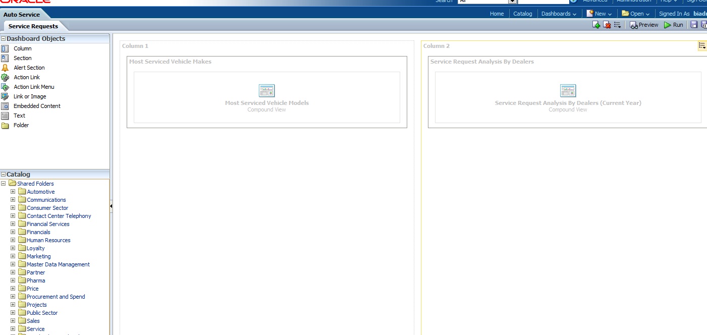
So, not bad at all. Although there are different dashboard objects that allows you to do different things with the dashboard, but most of the processes are still the same. So if you are familiar with how to create dashboards, it isn't so different here either..
So let's stop here then... My purpose is to help you take the element of fear of uncertainty out of the equation. I hope that now you see 11G isn't that different from 10G fundamentally, it should make your learning and getting used to much easier.
Go and play with it, let me know what are your likes and dislikes.
Until next time


