


Hello
Today I want to share with you a technique that I use to intelligently get last business day of each month in OBIEE taking accounts of holidays, this technique is useful when all you have is just a basic time dimensions with year, month and date to start with:

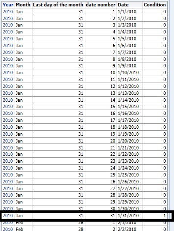
Now, the first step is to identify all of the day number of each months and the maximum day number of each month. OBIEE has native function to get you the day number in a month.
So I am going to create 3 columns:
Date number: dayofmonth(date)
Last Day of the month: Max(Dayofmonth(date) by year, month)
Condition: Compare Date number and Last Day of the month, if they are equal, then 1, else 0

The result of the above report will look like the following, and the row that's highlighted is going to be the last day of each month, because the maximum date number in Jan is always 31 and it happens to be equal last day of the month for THIS ROW.

Now, simply apply a filter where condition = 1, then the report will always give you last day of every month:

Now that we have the last day of the month, we now need to determine whether that happens to be the business date or not. So if it falls on saturday, then the business day has to be one day prior; if Sunday, then 2 days prior; if on Monday and holiday, then maybe 3 days prior depending on your company's rules. So we can program these things using case statement with timestampadd.
First, add another 3 columns:
Last Business Day: This converts day into day names, such as Monday, Tuesday, Friday etc.
Last Business Day Case: This is where the main logic of determining what's business day is created.

Here in my company, the rules are pretty simple for holidays. If the last Monday of May happens to be May 31st, which is memorial day, then last business day of May of that year should be 3 days prior; if 12/31 falls on Tuesday thru Saturday, then last business day should be 1 day prior; if Sunday, then 2 days; if Monday then 3 days. The rest, just weekend scenarios, which is either minus 1 day or 2 days.
So my formula is the following:
case when DAYNAME("Time"."Date") = 'Sun' THEN TIMESTAMPADD(SQL_TSI_DAY, -2 , "Time"."Date") when DAYNAME("Time"."Date") =
'Sat' then TIMESTAMPADD(SQL_TSI_DAY, -1 , "Time"."Date") when DAYNAME("Time"."Date") in ('Sat','Fri', 'Thu', 'Wed', 'Tue')
and "Time"."Month" = 'Dec' then TIMESTAMPADD(SQL_TSI_DAY, -1 , "Time"."Date") when DAYNAME("Time"."Date") = 'Sun' and
"Time"."Month" = 'Dec' then TIMESTAMPADD(SQL_TSI_DAY, -2 , "Time"."Date") when DAYNAME("Time"."Date") = 'Mon' and
"Time"."Month" = 'Dec' then TIMESTAMPADD(SQL_TSI_DAY, -3 , "Time"."Date") when "Time"."Month" = 'May' and DAYNAME
("Time"."Date") = 'Mon' then TIMESTAMPADD(SQL_TSI_DAY, -3 , "Time"."Date")
else "Time"."Date" end
Now for the use case. The user want to be able to select any integer from 1 to 12, and the report should show data for the last business days of each month for the last 1 to 12 months including the date the user pass from the prompt.
Therefore, This report has to have a filter on date, which is Date <= @{Date}. This not only accepts the user input date, but also allows the report the show all of the past days too.
Add another column that Rank dates: Rank(date). This column will return integer as a ranking number from high to low.
More importantly, apply a filter on rank(date) column:
Rank(date) <= @{N}. This will allow the report to run for N number of past month's last business date based on user inputs.


Today I want to share with you a technique that I use to intelligently get last business day of each month in OBIEE taking accounts of holidays, this technique is useful when all you have is just a basic time dimensions with year, month and date to start with:

Now, the first step is to identify all of the day number of each months and the maximum day number of each month. OBIEE has native function to get you the day number in a month.
So I am going to create 3 columns:
Date number: dayofmonth(date)
Last Day of the month: Max(Dayofmonth(date) by year, month)
Condition: Compare Date number and Last Day of the month, if they are equal, then 1, else 0

The result of the above report will look like the following, and the row that's highlighted is going to be the last day of each month, because the maximum date number in Jan is always 31 and it happens to be equal last day of the month for THIS ROW.
Now, simply apply a filter where condition = 1, then the report will always give you last day of every month:

Now that we have the last day of the month, we now need to determine whether that happens to be the business date or not. So if it falls on saturday, then the business day has to be one day prior; if Sunday, then 2 days prior; if on Monday and holiday, then maybe 3 days prior depending on your company's rules. So we can program these things using case statement with timestampadd.
First, add another 3 columns:
Last Business Day: This converts day into day names, such as Monday, Tuesday, Friday etc.
Last Business Day Case: This is where the main logic of determining what's business day is created.

Here in my company, the rules are pretty simple for holidays. If the last Monday of May happens to be May 31st, which is memorial day, then last business day of May of that year should be 3 days prior; if 12/31 falls on Tuesday thru Saturday, then last business day should be 1 day prior; if Sunday, then 2 days; if Monday then 3 days. The rest, just weekend scenarios, which is either minus 1 day or 2 days.
So my formula is the following:
case when DAYNAME("Time"."Date") = 'Sun' THEN TIMESTAMPADD(SQL_TSI_DAY, -2 , "Time"."Date") when DAYNAME("Time"."Date") =
'Sat' then TIMESTAMPADD(SQL_TSI_DAY, -1 , "Time"."Date") when DAYNAME("Time"."Date") in ('Sat','Fri', 'Thu', 'Wed', 'Tue')
and "Time"."Month" = 'Dec' then TIMESTAMPADD(SQL_TSI_DAY, -1 , "Time"."Date") when DAYNAME("Time"."Date") = 'Sun' and
"Time"."Month" = 'Dec' then TIMESTAMPADD(SQL_TSI_DAY, -2 , "Time"."Date") when DAYNAME("Time"."Date") = 'Mon' and
"Time"."Month" = 'Dec' then TIMESTAMPADD(SQL_TSI_DAY, -3 , "Time"."Date") when "Time"."Month" = 'May' and DAYNAME
("Time"."Date") = 'Mon' then TIMESTAMPADD(SQL_TSI_DAY, -3 , "Time"."Date")
else "Time"."Date" end
Now for the use case. The user want to be able to select any integer from 1 to 12, and the report should show data for the last business days of each month for the last 1 to 12 months including the date the user pass from the prompt.
Therefore, This report has to have a filter on date, which is Date <= @{Date}. This not only accepts the user input date, but also allows the report the show all of the past days too.
Add another column that Rank dates: Rank(date). This column will return integer as a ranking number from high to low.
More importantly, apply a filter on rank(date) column:
Rank(date) <= @{N}. This will allow the report to run for N number of past month's last business date based on user inputs.

Now lets test the report. As you can see, my default user input date is 5/2/2016, and default number is 6. Now I am getting 5/2/2016 as well as 5 other dates in the past that happens to be past month's last business date.

An actual report may look at this as below where the user select dates, period level and number of period on the left and he report shows last N months or week's of last business date from user selected date:

Thanks, until next time


